Common sense or education?
I often find myself in situations where I feel compelled to address the disrespectful behavior of fellow travelers. Many people tell me to mind my own business and ignore such incidents, but I simply can’t. I have too much respect for the countries I visit, their people, and their culture. I feel privileged to be able to explore their homes, and I don’t want to be associated with those who lack consideration or education. Today, I was reminded that speaking up can make a difference.
While working at a café, I noticed a young couple sitting outside. They were eating and drinking—products they had bought from a nearby 7-Eleven, not from the café itself. The staff had just cleaned the floor 15 minutes earlier, and it was spotless. The girl stepped away for a moment, and the guy, after finishing his cigarette, casually tossed it on the ground and crushed it with his foot. I felt my blood boil, but I stayed calm. I grabbed an ashtray, walked over to him, and stood silently in front of him, pointing to the ashtray. He stared at me, pretending not to understand, so I simply glanced at the cigarette butt on the floor. Reluctantly, he bent down, picked it up, and tossed it into the ashtray. I placed the ashtray back on a nearby table and walked away.
About 10 minutes later, from across the street at my hotel, I saw him lighting another cigarette. This time, however, he reached for the ashtray and used it properly. It was a small victory, but it mattered.
I’m glad I intervened. It cost me nothing, but it showed the café staff that their hard work was valued and respected. Sometimes, standing up for what’s right—even in small ways—can make a difference.
What would you have done in the same situation?
NomaderWhat Ep.07 JeanLo & Charline EuroTravel
Tant de passions communes, du boulot aux activités sportive, du voyages à la nature, un couple parfait pour le voyage, Charline et JeanLo vous en disent plus sur les routes d’Europe :-)
QUESTIONS JEAN-LO ET CHARLINE
- D’où venez vous et qui êtes-vous?
On vient de Grenoble dans les alpes françaises
Jlo sportif
(principalement ski et planche)
bricoleur, guitariste, moniteur de ski et bon vivant
Charline
artiste à ses heures perdues,
une grande rêveuse qui réalise ses rêves doucement mais sûrement
- Comment vous êtes vous rencontré
On travail tous les deux dans le milieu du bâtiment.
On sest rencontré au travail, en 2017, on travaillait ensemble sur le projet du siège de Schneider électrique à Grenoble.
- Quelle est l’aventure que vous vivez en ce moment?
Road trip en Europe pendant 7 mois: Norvège, Finlande, Estonie, Lettonie, Lituanie, Pologne, Allemagne, République Tchèque, Slovaquie, Hongrie, Roumanie, Bulgarie, Grèce, Albanie, Monténégro, Croatie, Slovénie, Italie
- Quelle a été la motivation d’entreprendre ce voyage?
Jlo n'a jamais voyagé très loin, longtemps
Charline a toujours voulu vivre une expérience à l'étranger mais une maladie auto-immune, un ex, le covid... c'était jamais le bon moment jusqu'à l'année dernière, après une avalanche d'amour durant le mariage de sa sœur et de son beau frère, c'était devenu une évidence. Derrière, tout s'est déroulé presque naturellement.
Côté boulot Jlo avait besoin de faire une coupure.
Charline terminait une mission en presta.
On a hésité à partir en mode backpaker à l'autre bout du monde ....mais après 3semaines magiques en Irlande l'été dernier en van... on s'est rendu compte qu'il y avait beaucoup à découvrir en Europe.
- Quelle est votre plus belle histoire en voyage (seul et ensemble)
Seule jlo
J'etais partit seul pour une nuit en bivouac en Belledonne, sur un de mes spots préférés, au bord du lac blanc juste sous le grand pic de Belledone. Il ne faisait pas très beau, presque personne, le calme. En essayant de voir le coucher du soleil a travers la brume qui montait et descendait, je distingue très près, remonter à travers la brume, une grande ombre de cornes de bouquetin. C'est finallement tout un troupeau qui arrive, à quelques mètres seulement, il sortent de la brume et passent en marchant/galopant légèrement doucement.. Un spectacle exceptionnel que je n'aurais surrement pas vu si je n'étais pas seul.
Seule charline
C'est très rare que je voyage seule, j'étais en week-end dans l'appartement de ma mère dans les hautes Alpes. Au programme méditation, rando, marché de Gap, tourtons, .... Mon plus beau souvenir sera une glace chez artiflore à chabotte avec mon carnet à idée
Ensemble
Kayak avec des dauphins en Irlande. On avait eu un départ un peu chaotique, on avait dû s'arrêter pour repositionner les sièges du kayak car avec la houle on avait pris trop d'eau dans le kayak. On fait le tour d'une petite île. Et là jlo voit 2 dauphins. Et quelques minutes plus tard un "troupeau " de dauphins à une centaines de mètres qui nous arrivent droit sur nous. À une dizaine de mettre ils plongent. Et Charline voit un dauphin passer sous le nez du kayak. De retour sur la terre ferme, en soirée on décide d'aller voir le coucher de soleil (difficile à voir en Irlande) sans compter sur les dauphins de la journée qui nous font le show
- Quel impact ont les réseaux sociaux sur votre périple et quelles plateformes utilisez-vous (et pourquoi)?
On regarde très peu sur insta pour trouver des choses à faire et on s'en sert peu, pour partager.
Notre famille et nos proches nous suivent sur polarstep.
Pour le sport, on utilise suunto (pour planifier )et strava pour partager nos sorties avec nos amis sportifs.
Park4night (incontournable pour la van life) pour trouver ou partager;
les spots dodo, parking, points d'eau, recharge en gaz, ....
Google map pour GPS, savoir ce qu'il y a à voir, commenter les restaurants quand ils sont bons
- Quelle est votre recommendation pour quelqu’un qui entreprendrait son premier voyage en général
Avoir un équipement adapté et un bon téléphone avec du data (GPS, réserver les bateaux ou les musées, communiquer avec nos proches,.....)
=> être indulgent envers soi, car on va faire des erreurs, et c'est pas grave. Ça peut parfois être grave pour le porte monnaie, car on a converti notre monnaie au mauvais moment et/ou au mauvais endroit c'est un exemple mais il y en a pleins. Du coup, avoir une bonne carte bleu sans frais (pour nous c'est fortuneo).
Et vérifier les assurances de votre carte bleue, de l'assurance du van ce qui permet d'ajuster si on besoin d'une assurance complémentaire.
Garder l'esprit ouvert à tout ce que l'on peut decouvrir et parler mieux anglais que jlo
- …et pour un premier voyage en van ?
Avoir un bon van (en " bonne santé ")
Faire un test d'un week-end, avant de partir pour plusieurs semaines ou mois comme nous.
Peut-être commencer doucement en allant dans des campings et de temps en temps faire un spot en pleine nature.
En sauvage, respecter la nature et les autres. Ne pas laisser des déchets, ne pas rester à proximité d'habitation, et plus généralement de pas camper pendant plusieurs jours (à part si ça ne gêne pas on s'entend)
- Quelle sont vos priorités dans le voyage et ses enseignements?
Nos priorités
Découvrir l'Europe et sa nature
Faire un maximum de sports d’extérieur "outdoor " (de la planche pour jlo)
Découvrir l'histoire et la culture de chaque pays.
L'aventure, sortir de sa zone de confort.
- Quels sont les préparatifs que vous recommanderiez: matériel, équipement, connaissances, langues, préparation, planification…
La to-do-list avant de partir était longue.
On a mis 3 bonnes semaines pour être prêt. Entre préparer le camion, préparer nos affaires et préparer notre appartement car on l'a mit en location (à un ami)
Ça ne nous a pas empêcher d'oublier des trucs comme la procuration pour les européennes (mais pour les législatives nous sommes allés à l'ambassade de France à Helsinki)
Ça fait depuis 2015 que jlo a aménagé son camion et ça fait depuis 2019 qu'on voyage ensemble chaque année.
Mais il a rajouter un chauffage sur le réservoir d'essence, refait tout le tableau électrique au propre, changer les 2 batteries,...
Charline a planifié la route grosse-maille depuis janvier (on devait commencer par le nord de l'Italie pour faire une boucle mais au final on fait l'inverse pour des questions météo) mais les 2 sens avaient ses avantages et ses inconvénients.
On planifié plus finnement pendant le voyage et souvent un peu à l'arrache .
(Équipements du camion, réservoir eau pour la douche et la cuisine, glacière électrique avec batterie secondaire et PV, chaudière gaz pour l'eau chaude de la douche, réservoir eau usees, toilettes sèches.)
Pour charline
Pour bien se préparer c'est important de "conscientiser" son quotidien de quoi a-t-on besoin dans sa trousse de toilette, la vaisselle, les médicaments de première nécessité, des outils en cas de problème, les toilettes,....
Tout dans un van doit avoir une utilité voir une double utilité (exemple la table sert pour manger mais aussi pour le lit )
- Etes-vous des voyageurs CULTURE, CULINAIRE, SPORT, AVENTURE, PLAGE, MONTAGNE, PLANCHA (recto-verso sur la plage)
On est des voyageurs plutôt sport en montagne et à la mer ou sur des lacs
Dans le camions on a; 2 planches, 5 voiles, 1 kayak et 1 paddle gonflables, 2 gros sac de randonnée, 2 sac de randonnée pour la journée, 2 sac de trail, 1 table avec 2 chaises de camping, 1 hamac, ....
Voyageur culture quand on arrive dans des grandes villes ou vers de beaux monuments.
- Avez-vous des restrictions (Charline tu faisais allusion à la santé - si tu souhaites en parler bien sûr - ça peut en aider à surmonter l’appréhension)
Il me reste un médicament, mais j'ai pu partir avec l'ensemble des médicaments avec une ordonnance (où il est spécifié qu’il s’agit d’un retrait en une fois avec une attestation sur l'honneur (ce dernier document m'a été donné par la pharmacie))
Sinon nous n'avons aucune restriction à part être rentré avant fin novembre Pour un rdv médical important.
Pour JLo aucune restriction, mange tout, teste tout, boit tout.
- Comment voyez-vous l’après-voyage?
Très bonne question.... pour charline travailler en tant que prestataire ou avec ma mère ou reconversion pro à voir
La saison de ski pour jlo dans un premier temps.
- Et jusqu’à aujourd’hui, quel est votre plus importantes conclusion/constation/apprentissage de à ce que vous avez déjà traversé?
On a de la chance de vivre en France.
C'est important de bien parler anglais
On est jamais en train de rien faire et ça peut être fatiguant....à travailler
Après avoir traversé plusieurs frontières, quand on est français c'est facile de voyager en Europe
On a apprit beaucoup sur l'histoire des pays de l'Est et ça nous permet d'avoir une autre approche de l'Europe dans toute sa complexité.
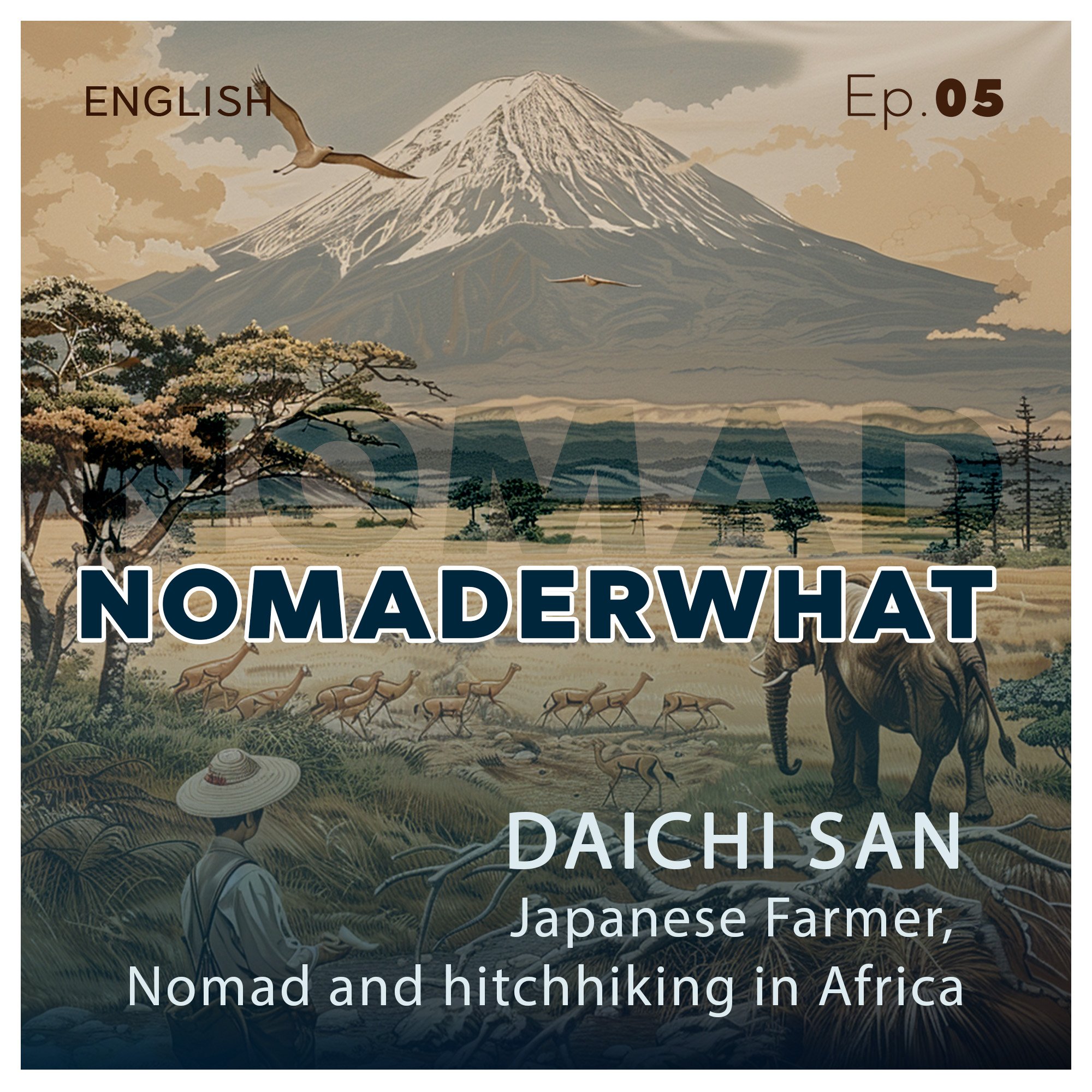
NomaderWhat Ep.05 Daichi, Japanese traveler, nomad and hitchhiking in Africa
Most of us love to travel and discover the world, but how do we travel? Are we conscious about what we see, what we learn, the history, the culture and traditions? Today, Daichi tells us about his experience in Africa as a hitchhiker, nomad and happy japanese farmer, but also about his take about his country and its tourism…
What else would you like to know about Japan?
NomaderWhat Ep.06 What I learned about waiting at a traffic light in Japan… Have a Break, Have a TikTok
Have a Break, Have a TikTok... or what I learned about waiting at a traffic light in Japan… doesn’t only apply to my private life, but has a huge impact on my work, internet content and a certain peace of mind…
NomaderWhat Ep.04 Kamons, Coat of Arms and Logo Design? (Copy)
Most of us love to travel and discover the world, but how do we travel? Are we conscious about what we see, what we learn, the history, the culture and traditions? Well, that’s precisely how I discovered today’s topic, THE KAMONS of JAPAN
NomaderWhat Ep.03 NomaderWATT
Die meisten von uns lieben es, zu reisen und die Welt zu entdecken, aber wie reisen wir? Sind wir uns der Auswirkungen auf unsere Umwelt, auf unser Publikum in den sozialen Medien und auf die Orte, die wir besuchen, bewusst?heute erforschen wir die ELEKTRO-Mobilität, Zukunftslösung oder nicht?
Lassen Sie uns darüber reden!
NomaderWhat Ep.02 L'amour dans la jungle
La plupart d'entre nous aiment voyager et découvrir le monde, mais comment voyageons-nous ? Sommes-nous conscients de l'impact sur notre environnement, sur notre audience dans les réseaux sociaux et sur les lieux que nous visitons?
Aujourd'hui, c’est Marine qui nous parle de son aventure dans une tribue Karen, dans la jungle, au nord de la Thaïlande…
NomaderWhat Ep. 01 Travelicious
Most of us love to travel and discover the world, but how do we travel? Are we conscious about our impact to the country we visit? Aware of what changed for us after visiting a new place? Do we behave accordingly, do we even know how?
Some of these questions are very well covered in this 1st episode of NOMADERWHAT with my friend Anna, from Bali…
Happy listening
Kamons, Coat of arms, and flat design, common points
Do you know Japan and its ancestral customs, this country of the rising sun which for several decades remained totally isolated from the rest of the world, in the most perfect autarky, preserving its heritage, its culture, its rites, and its customs?
Then came the Americans, again and again, forcing the Japanese empire to open its ports and doors to the world's other markets and trade. That was in 1854, under the command of naval officer Matthew Perry.
Since then, this archipelago at the end of the world has fascinated, intrigued, and inspired entire generations.
Among its impressive traditions are the Kamon (also known as Mondokoro or Mon).
Often compared to the European coats of arms of noble and warrior families,
Kamons have a much wider application and are still abundantly present in all strata of society in the 21st century. The most popular is the Chrysanthemum (etymologically "the golden flower"),
used as the official seal of Japan or the imperial seal (first page of Japanese passports). But there are thousands of them (some say there are more than 20,000), of all kinds, always represented in a circular shape, graphically very simple, with no effect of thickness or volume, mostly monochromatic and always geometrically impeccable.
Unfortunately, it's hard to date their origins, but traces of them can be found as far back as the 5-6th centuries. Initially used mainly by wealthy families, they quickly became a symbol of war by the Samurai, making it easy to recognize one's clan in a battle zone. They were brandished on banners and flags (Hatamaku), but also on tombs, furniture, and boats, particularly by the samurai (or Buke) and the Kuge (Japanese nobility).
Their use is more or less free, with the exception of the imperial emblem and certain noble families today, which can create friction depending on how they are used. But generally speaking, there are no real prohibitions or official rules on their use (which is surprising for a country like Japan, where most traditions are highly regulated and particularly well structured).
Later, unlike the European coats of arms, which were exclusively reserved for aristocrats, their use was extended to the entire population, and Kamons were found on a variety of products, including Manmaku, the traditional curtains used in front of Japanese shop entrance, and on kimonos and yukata (of which there are usually 1, 3 or 5, one being mostly on the chest), used by farmers, merchants, Rakugo (storytellers, very famous in Japan) and even worn by Yujo (prostitutes - whose status is very different in Japan from that in Western countries, but we'll come back to that in another article).
At the end of the Edo period, as Japan was forced to reopen to the world, in the second half of the 19th century, the world discovered the Nippon Empire and the Kamon became one of the symbols of art nouveau in Europe, representing the images of Japonism.
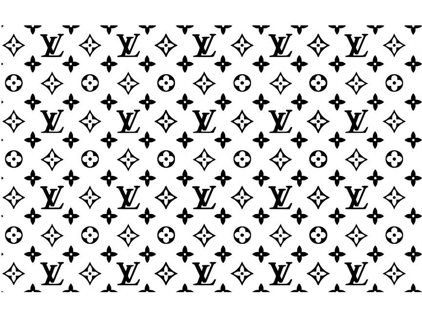
Their aesthetic is famous abroad, due to their symbolic design, a simplified structure often used in the world of design. The best known of these are the Mitsubishi logo and, more surprisingly, the Luis Vuitton emblem,
but if we go further and look at the graphic trends of the last 5 years, we see that the notion of Flat Design (totally uncluttered, flattened, with no thick, multi-dimensional effect, often monochromatic and very often represented in a shape that would easily fit in a round or square shape. We can easily find some connections or inspirations, don’t you think?
The examples are more than impressive: in the car industry, for example, all the brands have remove all three-dimensional aspect of their identity, almost all of them limit themselves to one colour (often black), and their entire visual identity is based on the same principle.
You could see this as being inspired by the big computer brands, such as Apple,
but when you look at the construction of the Kamons, their use, and their representations, the similarities are uncanny. An ancestral Japanese creation could well be one of the origins of 21st century logo graphic design. The round and square shapes, for example, are largely the result of the size limitations imposed on us by computer tools (web/mobile application logos, stickers, and other profile images, among others, are always round or square),
but you have to admit that it's amusing to see just how far ahead Japanese art was in terms of creativity and, more impressively, longevity. Imagine if we could find the coats of arms of our ancestors on our everyday objects? on shop fronts or on our clothes? There are indeed a few traces here and there (big schools/universities, bottle of gin or ketchup, and other products from the British Empire) but it's all very modest compared to these magnificent and very inspiring Kamons.
is it a pure coincidence? or Are creative to lazy to create more elaborate design? Or is it precisely more challenging to create something very simple? Let us know what you think andt in the meantime, thank you for reading this article, I hope you found it useful or at least interesting, and if you have any questions or comments, please don't hesitate to leave a message, see you soon!
Why NOMADE and why DIGITAL?
Two inseparable passions, firstly TRAVEL, discovered at a very young age by a father obsessed with the world, dreaming of becoming a war reporter, discovering the world through his lens, which had brought him out of a renowned Parisian photography school.
Childhood memories are filled with photographic images, scenes from faraway countries such as Pakistan, Afghanistan and Iran, - before the war, with cities like Islamabad, Kabul, or Tehran, as beautiful as Paris back then, people in beautiful fashion walking in shopping streets - framed and hung on the walls of the flat. A photo studio in the large office of the medieval house we occupied at the time. A laboratory where my father loved to develop his photos. It was professional, precise, and diligent.
TECHNOLOGY then, which I also discovered at a very young age, when I started taking apart old radios and broken televisions that I'd found here and there. Nobody wanted them anymore, but their innards fascinated me. Another inspiration came from my grandfather, who built me a tiny wooden house with all sorts of salvaged parts and leftover electrical/electronic equipment, it even had light in every single room, ran by an array of batteries in the back and switches to control them independently (he was working at Philips at the time) and also taught me woodworking, sawing, sanding, planing... I loved it.
At the age of 21, I became an acoustic technician, making earmoulds for hearing-impaired people for a big American company, learning poly/monomer, mixing, sculpting, and fitting. And then a few years later, the big turning point that allowed me to combine the TECH & TRAVEL, I was hired by the company that handled repairs and technical support for NOKIA in Switzerland. At the time, the consumer market was still in its infancy, 1997. The years that followed were dominated by learning about all the technologies that now allow us to work anywhere, to travel without a folding road map, to run a business from a corner of a table, in a hotel in Taiwan, on a beach in Thailand or, as now, in a café in Yokohama, sheltered from the typhoon that is approaching our coast.
And long before the COVID pandemic, I started home office, trying all possible ways of working remotely. Searching for all the best combinations in terms of structure, gear, place, spaces… Finding the best tools for the lighter or at least most efficient travel-work balance. Today, I’ve been
in many countries, learning multiple languages and cultures, but most of all, being almost totally independent to work from absolutely anywhere (and if you’re interested to know more, don’t hesitate to comment and ask, I’d love to hear from you).
And in addition to all this, for many years, my nights have been filled with powerful dreams, involving trains, airports, stations and underground stations, and a great solitude, which has now partly become independence. This morning, on the train between Narita and Yokohama, watching all these stations, tunnels and railway lines go by, crossing and merging, separating and disappearing behind blocks of flats, only to reappear on one of the bridges spanning the river we were crossing. My dreams suddenly seem to make sense, to come alive in the real world. Were they premonitory? Were they the path I needed to follow to discover this world I love so much? This Japan built mainly around its trains? I don't have all the answers yet, but it seems more logical than ever.
Do you know the feeling of being addicted to something? For some it's work, others housework, sometimes drink, others will be under the influence of drugs... For me, it's TRAVELING and the techniques that make it possible, but also all these technologies that we can use to create, photograph, paint, write, work, invent, invest or program. Some people travel by visiting temples and taking selfies for their Instagram (which I do to, except the selfie). Personally, I love spending hours in specialist centers, looking for that gadget that no one else has, that accessory that will lighten my suitcase (when in fact it has forced me to add an additional suitcase to my luggage:-D) and of course learning to understand, learning to use, learning to master, to travel more, to generate income and to be independent. That's how I became a nomad. And digital.
So how can I want to settle down after all these discoveries, all these countries, and experiences? How could I not want to carry on, knowing that there is still so much to see... And yet Japan keeps winking at me, making me want to settle down, have a place to rest, recharge, refuel, and set off on new adventures. Why Japan? For its traditions, its culture, its incredible culinary choices, the beauty of its people, and the complexity of communication that puts up so many barriers, while allowing rare but exceptional encounters.
So what are your dreams? What have you achieved since you were a child? What does traveling mean to you? I'm looking forward to reading what you have to say... see you tomorrow, perhaps.
Friendships, the traveller's sacred enemy...
All my life, I've considered friendship to be a powerful and important relationship, but also a very selective one in my case, and the more the years go by, the more I've kept it to a minimum.
Our society has been built on this new virtual friendship, where friends are accumulated like coins on networks supposedly social. Remembering each other's birthdays through notifications rather than any real interest in each other. Following the adventures of some, the culinary tastes of others, the political reactions of a few, comfortably seated behind our screens, ALONE. And when we find ourselves in a life we call ‘IRL', sharing our travel experiences, anecdotes and political indignation, it's often to hear: "yes, I saw that on your Facebook page", "yes, I saw your post the other day", and this often brings this part of the conversation to an abrupt close, a way of hearing them say: "thank you, I've seen the main thing on your page, the rest doesn't interest me much".
And in perfect contrast, the imagination of our 'followers' when they watch our publications, imagining us riding a white dragon through fairytale landscapes, golden sword in hand, off to rescue a totally illusory princess...
Am I the only one who feels this way about our society, or do you also have the uneasy feeling that the more connected we are virtually, the less connected we are in the 'real' world?
In 2016, when I began my journey (which I'm still on today), I met Anna, an American young woman travelling with her camera slung over her shoulder like me. We were both solo travellers and shared a day exploring the backstreets of the magnificent city of Istanbul in the aftermath of the Putsch on 16 July 2016. As we shared our impressions of the trip, I was particularly touched by one remark.
Anna pointed out that often, when you meet a complete stranger and only spend a day or two with them, you have this interesting tendency to open up more than with your best friend, your childhood friend, your sister or your neighbour. Why is this? Is it because you have nothing to lose by sharing yourself? Is it because you know that even if the person judges you, you won't see them again? Or is it the desire to know the other person's reaction to subjects that we don't necessarily dare discuss with people close to us? These questions and observations led me to start a project called 'BFFAD: Best Friend For A Day', which involves simply photographing some of the people I come across during my travels and keeping an indelible record of them.
What's funny about this definition of life and this project is that some of the people I've met have become real friends, people you stay in touch with over the years. Sending each other a message from time to time, just to check in, to make sure that everything's OK.
One of the consequences of this realisation is that today I've also become much more selective about the people I keep in my circle of friends. I'm no longer at all afraid of breaking off a pseudo-friendship that has become toxic or simply and totally useless. Do we really need hundreds of friends to be in tune with ourselves? How many friends do we need to keep our balance? How many friends do we need to look after them properly, to share them well, to guarantee a deep connection? Isn't it difficult to look after hundreds of friends, when a more limited number allows us to be more intimate? What do you think? What is YOUR definition of friendship?
I wish you a wonderful day, and if you're curious about the identity of these "best friends for a day", here's the instagram link.
See you soon!
7 years, over 20 countries, and 34TB of visual content later... (Ep. 01)
It was the end, an entire world was collapsing, the suffering was intolerable and I finally understood what it meant to have a broken heart. The feeling that a bomb has destroyed your insides, that your whole existence has turned to dust. And yet... that was only the beginning, and this story began on 25 June 2016 in Zurich, Switzerland...
I'll skip the details of the previous event, (let's just say that a break-up in love can be incredibly painful and seem insurmountable) preferring to focus on what resulted, the unimaginable.
So I packed my bags, taking only a suitcase and a rucksack. Leaving behind a few suitcases and boxes in a cellar, I sold the last of my furniture and impersonal belongings, or useless items if you prefer.
So here I am at Zurich airport, ready to board the next flight to Valencia, Spain, to meet up with a few friends and try to take stock of the months ahead.
2 weeks in this city where I lived between 2010 and 2013, soaking up the scents of the sea, the magnificently bright streets and the delicious cuisine of my friend Peejee, an Italian exiled in Spain and owner of a real little culinary nugget in the old town called Tinto Fino Ultramarino. A memorable photo shoot in the streets of the Valencian city with... (my memory has failed me...) nonetheless some magnificent visual memories.
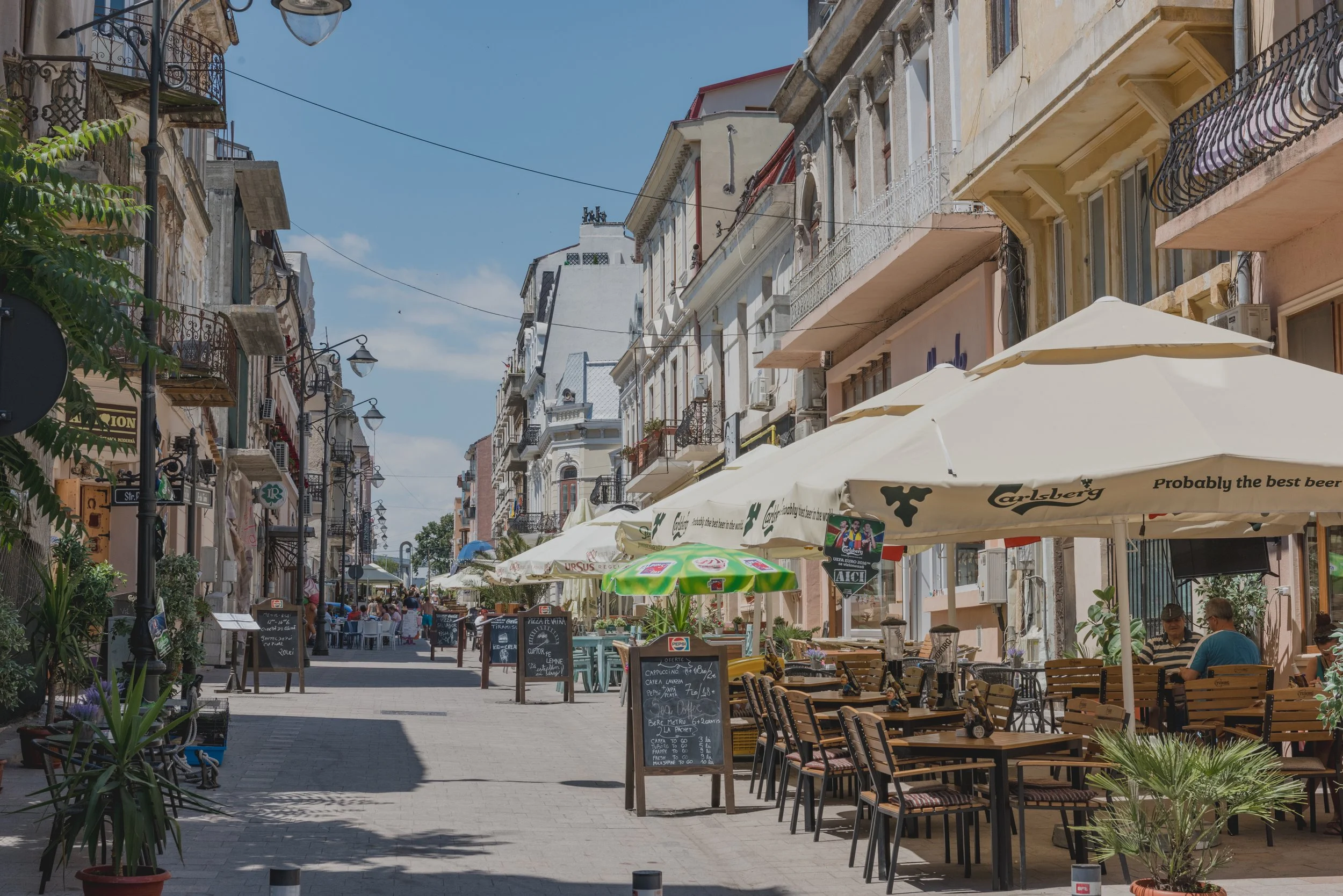
But keen to deepen this quest for self, I then left for Romania, to pay a surprise visit to Andreea. Alas, it was unsuccessful and we didn't get to see each other, but at least I would have discovered Constanta and had the wonderful surprise of changing my opinion of Romania, which had been distorted by a press and media that were deceitful and provocative. In fact, the mistakes we French speakers make in mixing up the names Roma and Romanians have the effect of reducing an entire people to the status of criminals, whereas in reality, the country has a remarkable cultural richness that is particularly interesting to those who take the time to get to know it.
My curiosity about the unknown led me to head for Istanbul, Turkey, for the simple reason that Constanta's small airport offers a direct connection.
And that's where the first real adventure began, on 15 July 2016, just a few hours (minutes even) after my flight landed at Istanbul airport, the army attempted a putsch and blocked the airport with tanks. That night, the city centre was the scene of a war, with Kalashnikov fire breaking the silence of my hotel room, not far from the great Blue Mosque...
But I'll tell you the rest later... that's also what a blog is for.
Thanks for coming all this way, and see you soon for the next episode...
A photographic day
What's a perfect day for you? You know, the kind of day that fills you up completely, from which you come home just exhausted enough to sleep well, your mind flooded with good memories.
Personally, I've been travelling for 20 years now, camera in hand, searching everywhere and all the time for that perfect light, that ideal framing, that unexpected scene, that surprising moment. Sometimes spending long minutes leaning against a wall, watching people go by, a train passing over a bridge, pedestrians strolling down a street, listening to music or sharing a fascinating discussion with the person accompanying them.
Sometimes taking a train to spend just 20 minutes in a station, lost in the countryside, to immortalise an emotion felt when passing through there earlier in the day.
My whole life is devoted to light, the light that surrounds us, encompasses us, floods us. This light that makes things and people look so different, depending on whether it's a morning light, an artificial one or the subtle light of a candle. This light is the most important basis in photography, this light that we can't control in street photography, but to which we have to adapt, this light that constantly challenges us, that always surprises us. This is the perfect day that I so wish I could make a living from, because I know it so well, I've mastered it, it fulfils me, I feel safe in it and it's become my identity through all these years of travelling, crossing more than 40 countries, filling dozens of hard drives with photographic and videographic memories. Immortalising our daily lives, the people around us, observing the elegance of Japanese women in the street, the temples of Bali, the Swiss mountains or a sunset on a Thai island. That's what a perfect day is all about, and today I'd like to share with you some images taken yesterday in the Chiba region, north-east of Tokyo.
Feel free to comment and share your experiences.
See you soon
A day in august, chasing perfumes and scents
Yesterday, I worked on my Blog in the morning, looking for answers and clues as to the direction I should take for my future. Then I dropped off my MacBook in my hotel room, packed up my camera, tripod and powerbank and set off for Narita station, to catch the Keisei-Line-Limited-Express to Shinjuku. It's a 1 hour 40 minute journey, through the Chiba countryside, then the Tokyo metropolitan area and finally the centre of the Japanese capital with its impressive urban density, so paradoxically peaceful.
The public transport journeys are disconcertingly simple. The use of modern communications tools makes it so easy to read signs, understand timetables and adapt quickly. Here in Japan, Google Maps makes it possible to follow the train you're on in real time, as well as other trains on the network. You can find out exactly which train to take, on which platform, by which escalator or lift. It even tells you which carriage to board for quicker access to which exit. It's simply amazing how far technology has come in giving us remarkable freedom of movement.
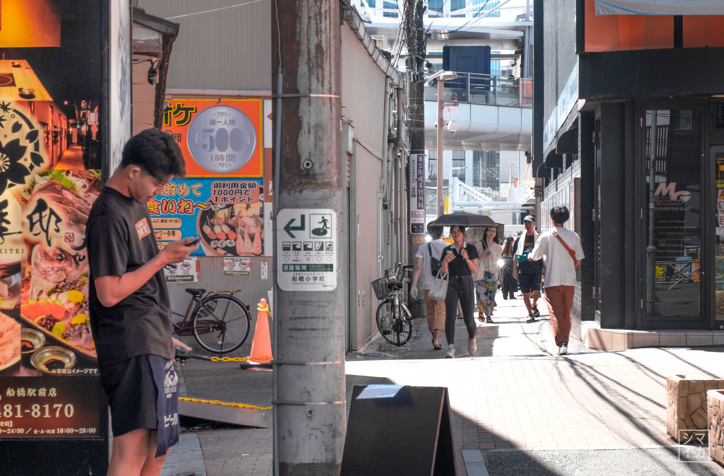
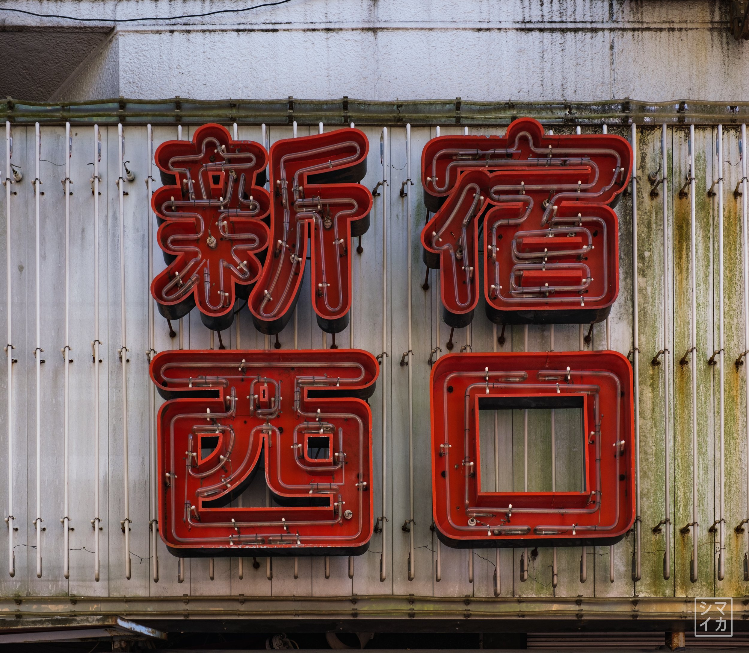
I got off at Shinjuku-Station, after revelling in the exceptional colours, flavours and scents. In the last 7-8 stations before getting to destination, I was seated next to a very elegant young woman whose perfume was totally intoxicating. It's very rare to smell a woman's perfume in Japan, as they are often very discreet. But the one she was wearing was a little something different, intense and subtle at the same time. Totally unsettling, I would have loved to have been able to point it out to her, to say something like "anata no kōsui wa subarashī desu" (your perfume is exceptional). Alas, these days it's the rule to have to be careful about everything you say or do about others, especially as a man (the proof is that even here, in these few lines of text, there's plenty to feed the ill-thinking souls... but it's the one who’s being accused who pays, rarely the one with the harmful thoughts). In short, I got off the train, without paying the compliment I wished to give, and wandered the streets, backpack slung over my shoulders, camera in hand, scrutinising the colours, moods, lights and reflections on the walls of the Yodobashi Camera district, with its big neon signs from another era.
This was obviously followed by a visit to the store specialising in photographic equipment (Yodobashi is the largest chain of shops specialising in electronic and technical equipment, located in Japan's biggest cities, often close to one of the main railway stations. The shops in Shinjuku are by far the best stocked, especially for film and digital photography. You'll find absolutely EVERYTHING. A photographer's paradise, hell for his bank account). Fortunately, my current situation doesn't allow me to deviate in any way, so all I did, exceptionally, was look, compare and fantasise about certain products.
Then I took the train back to Akihabara, then Asakusabashi, to see some leather goods shops (which I'd love to master and know how to use to make wallets, bags, pouches and other accessories for travellers...). The street that runs alongside the Shobu-Line metro station is very well stocked with raw leather, offcuts, tools and accessories - a veritable Ali-Baba's cave, spread over 4-5 shops under the 'And Leather' banner.
And finally the day ended with an hour's train journey back to Narita, a meal in a restaurant opposite my hotel, a good shower and some stupid videos on youtube...
Another day in the life of a digital nomad in search of his identity...
Why is it so hard?
The years go by, the months, the weeks, the days, the hours and I'm still at the same dead end. A whole life devoted to one passion: creativity. So many years spent taking images, retouching them. Creating visuals, trying out new techniques, looking for new ideas. I've tried so many programs, so many cameras and accessories, travelled so many miles, been to so many places and yet, today, I still feel that I haven't fulfilled my dreams, that I can't bring them to life. But can I articulate it? Can I define it? Or am I my own worst enemy, holding back any chance of success?
Even as a child, I loved to draw, to such an extent that my teachers were indignant that all document of mine contained a drawing, a sketch or an illustration. Even as a child, I doubted my skills, systematically considering that my creations did not live up to my expectations. There's a question that keeps coming back: "Why does an artist create? What motivates a creative person to keep on producing? Why does a painter produce hundreds of canvases, sometimes even with the same motif, the same model? Could it be the dissatisfaction with the work we've done that drives us to do better? Could it be a lack of self-confidence that forces us to look to art for what we lack in ourselves?
Why is it so difficult to sell yourself as a creative? Or am I really so uninteresting (...or my work)?
For over a year now, my financial reserves have been plummeting into freefall, with no (or almost no) income coming in. Total nothingness, at least professionally. No answers, no solutions, no openings, as far as I can see. Yet the dreams are still there, still present. To do dance photography again, to do an exhibition of the portraits I've taken around the world, to publish and sell in a gallery the images of these street scenes I've taken across Asia over the last 7 years, or to see my drone images displayed on a wall, on an aluminium plate, in beautiful light. Being able to FINALLY use the HUGELY hours of footage and pictures I've taken over the last few years to make/sell interesting stories. Being able to work for agencies and provide them with beautiful visuals. To make sure that all the energy I've spent so far finally pays off, and gives me financial security and the ability to fund my future travels. To find the opportunity to stay HERE in Japan, to find a nice place to settle and be able to live my creativity to the full, comfortably both financially and psychologically.
Have you ever been in a situation like this? Did you come out on top? What did you do, how did you get out of it or how did you develop it?
And if you find yourself in the same situation, what are your thoughts and how do you deal with them?
A day in a nomad's life... digitally
Yesterday, in my bedroom, I was redrawing in my mind the last few years I've spent on the roads and rails of the world, exploring the daily lives of the people in the countries I pass through, observing their rhythm, as they run to catch their early-morning tain, come home exhausted at the end of the day, asleep on the bench of an overcrowded train, while on either side, the other passengers are overwhelmed by the images on their smartphones, earphones screwed into their ears. Over the last few months, I've been wandering around this country that I love so much, despite the extreme loneliness. I love looking at the beauty of its people, the way they dress, their taste for aesthetics, the elegance of the women, whether in the centre of Tokyo's working-class districts, or in small towns like this one in Narita.
Sitting on my bed, I realised just how totally inexplicable and unimaginable my daily life is, so out of the ordinary.
I go to bed every night between 23:00 and 23:30, after watching a film and having a good shower.
In the morning, my alarm goes off at 07:10, I laze around until 09:00, get ready, have a breakfast bought the day before, get dressed, take my bag and my computer, walk to the café and then spend 3-4 hours writing, processing images, editing video or simply watching YouTube, to learn or just to entertain myself.
Then comes lunch, which I confess I don't have every day, or at least not always at lunchtime. In general, I spend the second half of the day exploring, discovering the area, the city, the region where I've decided to settle for a few days.
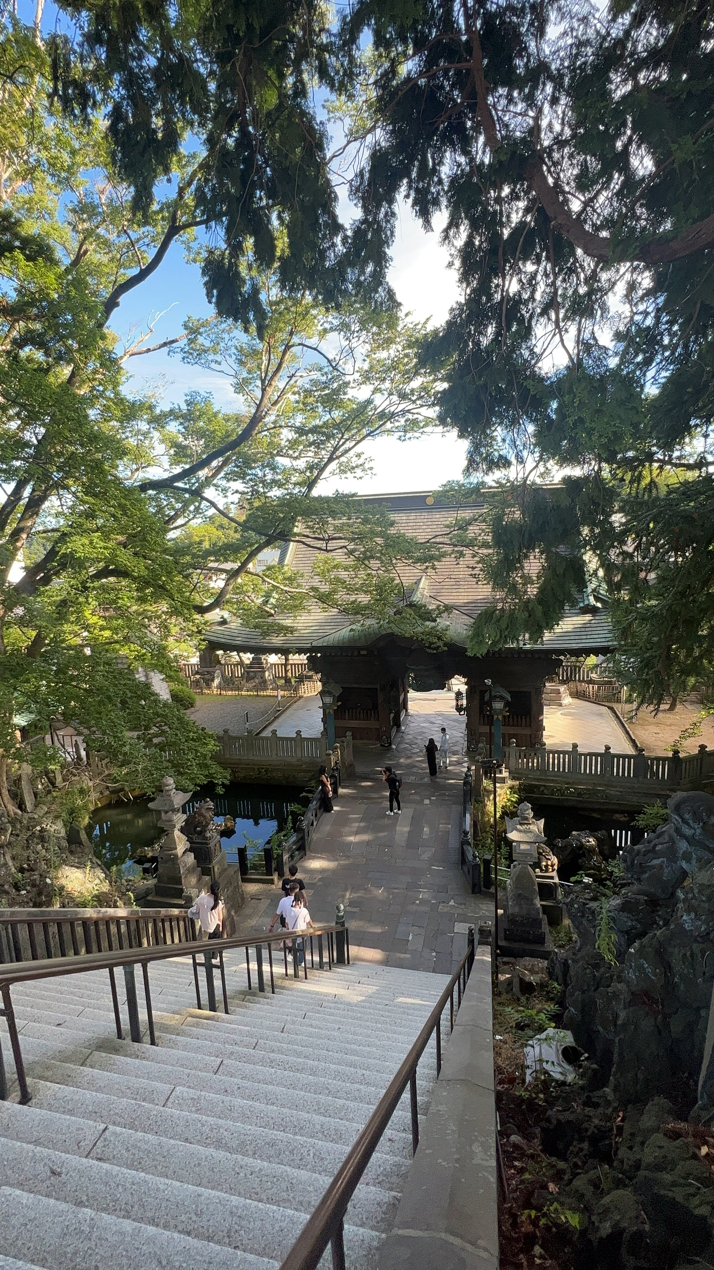
Yesterday, for example, I set off to discover Narita, where I'm currently spending around ten days, wandering through the streets criss-crossed by traditional houses and stalls selling delicacies and various souvenirs. I visited the superb temple and pagoda, and was intoxicated by the smells and sounds of the cicadas that are so typical of Japan in August. Their sound is powerful, very impressive for such a small animal.
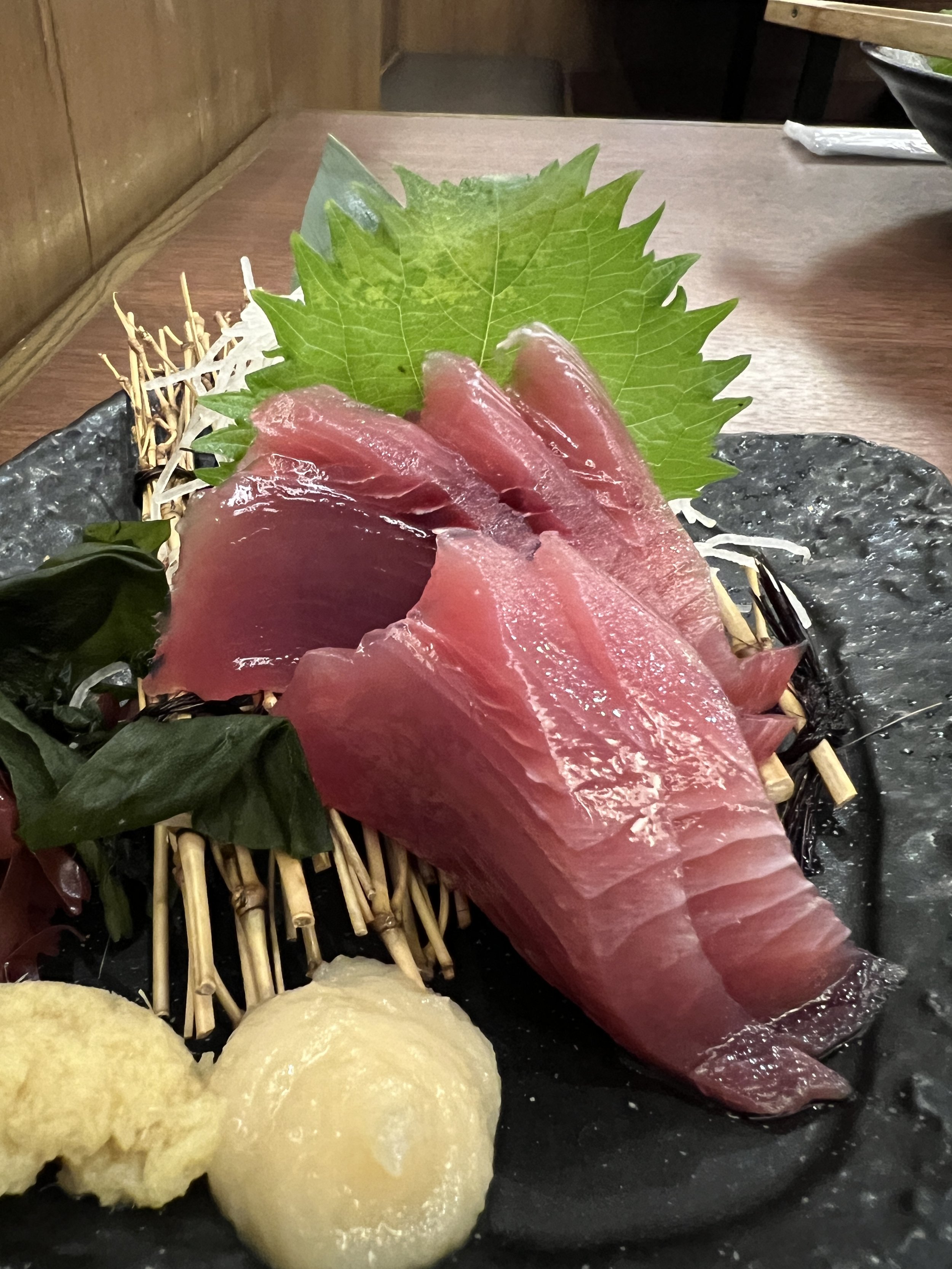
Then, on the way back up, I stopped off at this little restaurant I'd discovered the day before. I'd had Wagyu beef lasagne there and their menu had already tantalised me, so I went for a grilled wagyu steak with a side of vegetables, potatoes, garlic and wasabi. It was simply divine, served with a beer and topped off with a plate of seafood cooked in white wine.
I then finished my day as usual, but also by doing my laundry, which is always breathtakingly simple in this country. Every hotel offers access to several washing and drying machines, for as little as a few yen.
Today, I have absolutely no idea what to do, apart from write this diary... I'm craving the sea, sea smells, wind, extreme light and exceptional images.
A typhoon is approaching the coast of Kyushu, the southern island of the archipelago. It has already caused considerable damage on the islands of Okinawa, further south-west. The winds and rain are extremely violent, and the slow speed at which it is moving is causing even more damage on its way to Korea (Busan is likely to be hit very hard from Thursday, in 2 days' time). And since yesterday, another typhoon (the 3rd in less than a month) has appeared in the south-east and is getting dangerously close to Kanagawa, Tokyo and Chiba (where I am at the moment).
What's breathtaking when nature throws this kind of show at us is the extent to which the extreme is mixed with the beauty, the colours, the lights, the atmosphere it creates... If only more people had the capacity to look, to see, to take an interest.
That's why it's so much more rewarding to take your time when travelling, to allow yourself to be surprised, to experience the unknown, to be adventurous, to allow yourself time to be invaded by your surroundings, to find micro-routines and to meet people more than twice, just to be able to see them and share with them… an other wonderful day in a life full of doubts and uncertainty...


